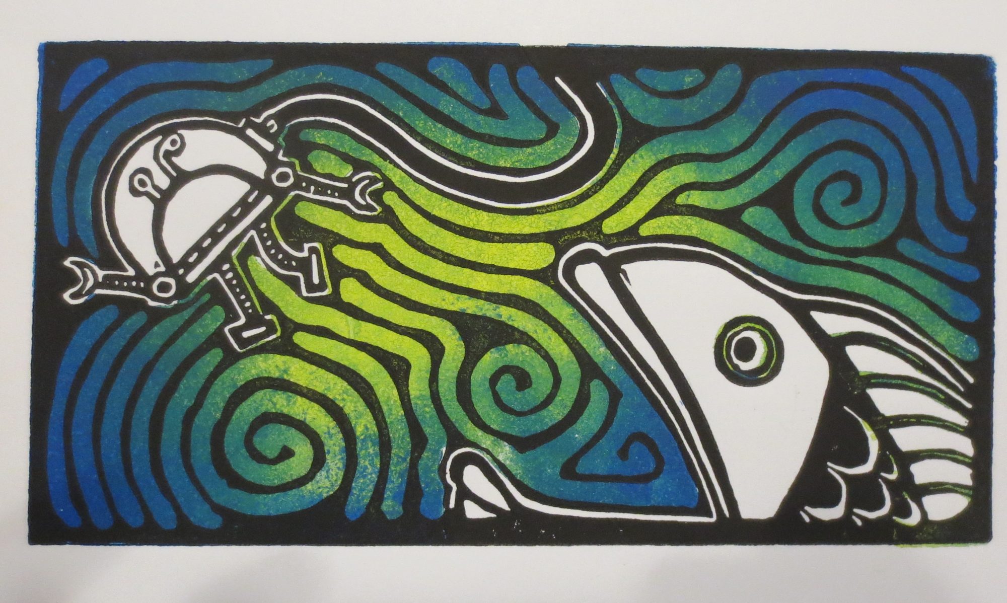
Here’s my print for the Four Oceans Press “Road Trip Alphabet Exchange” from this year. Sometimes plain black & white is quite nice.

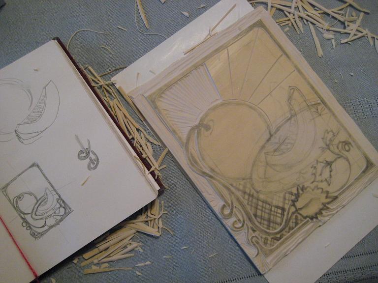
a work in progress….
Here’s my print for the Four Oceans Press “Road Trip Alphabet Exchange” from this year. Sometimes plain black & white is quite nice.


I’m in the middle of making another set of cards. 5 designs, 8 prints of each. I think that this set will be a little more obviously a “set” than the first set of cards I did this year.
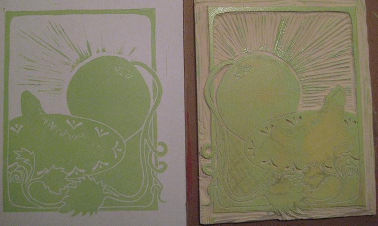
Here’s the first one I finished next to the linoleum block it came from:

I may resort to random on wikipedia for names again….

all the ice melted….
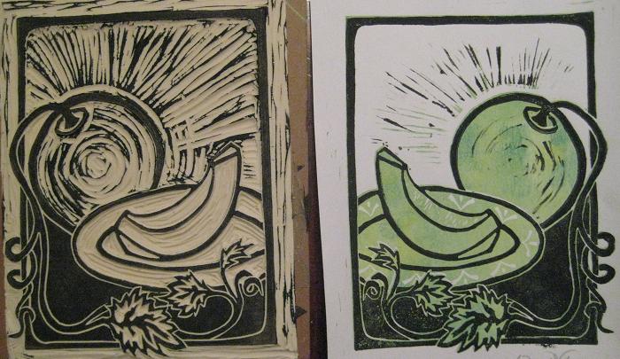
I really like how this one turned out….

Here’s how it was made:
Layer 1 = yellow. I wasted a LOT of yellow ink because I wasn’t thinking ahead. There is no reason that I needed to print the entire page in yellow. oh well. live and learn.

Layer 2 = adding copper in for the dandelion. Working smarter this time, I’m only rolling the ink where I know I’ll want the color to be.

Layer 3 = aqua. if I could go back and do it again, I’d probably pick orange or some other warm color since the aqua disappears with the addition of the next layer

Here’s what my kitchen table looked like this morning:

Layer 4 = violet, blue and white
Here’s what my kitchen table looks like right now:


Some more color proofs. Turns out this new ink works a little differently than what I’d been using before… and now I have a dozen small pieces of paper that say “Hello”. If you have any idea what to do with them, I’m all ears.

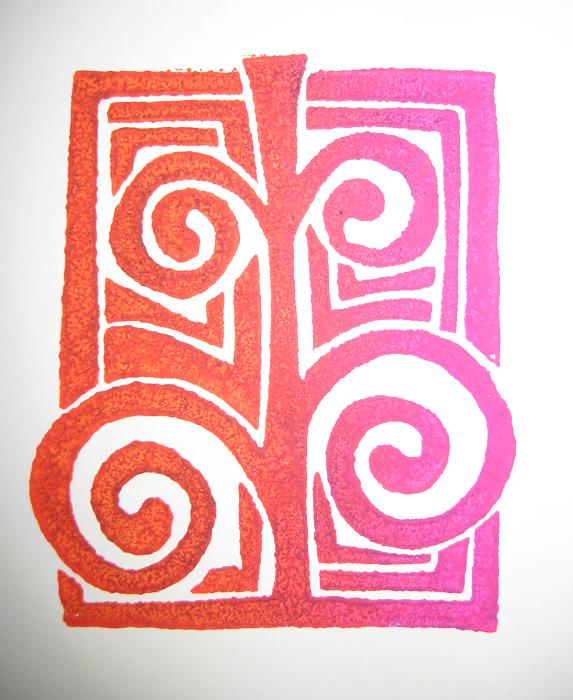
I made a (semi)quick proof for an idea I had…. and I had a really hard time picking what colors to use:

Here are some close-ups of a few selected color combinations:


I’m still not sure what I’m going to do for the actual print but luckily the procrastinating is facilitated by still not having any nice paper in the house