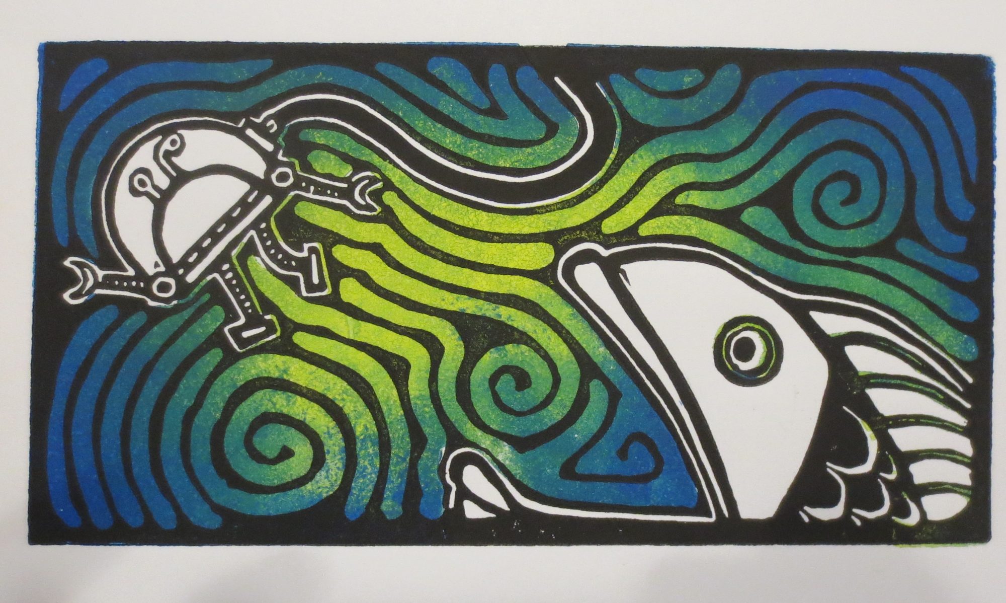
I made a (semi)quick proof for an idea I had…. and I had a really hard time picking what colors to use:

Here are some close-ups of a few selected color combinations:


I’m still not sure what I’m going to do for the actual print but luckily the procrastinating is facilitated by still not having any nice paper in the house 🙂
Definitely the darker blue background… best contrast for the composition. And I prefer the the Y/Br over the G/W fill…
Mark from STL
I think this is your best work yet.