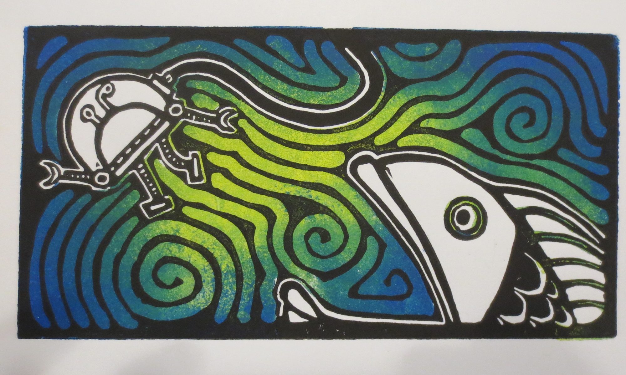
I really like how this one turned out….
Here’s how it was made:
Layer 1 = yellow. I wasted a LOT of yellow ink because I wasn’t thinking ahead. There is no reason that I needed to print the entire page in yellow. oh well. live and learn.
Layer 2 = adding copper in for the dandelion. Working smarter this time, I’m only rolling the ink where I know I’ll want the color to be.
Layer 3 = aqua. if I could go back and do it again, I’d probably pick orange or some other warm color since the aqua disappears with the addition of the next layer
Here’s what my kitchen table looked like this morning:
Layer 4 = violet, blue and white
Here’s what my kitchen table looks like right now:


Wow, I love it! The sky behind the stems looks amazing.
Gorgeous. Blanking on a name.
Nice work, Laima! They just keep getting better and better.
“a joyful dispersion”
Wow!